The Arcadia Report
Transform any city into an escape room
“I want in, I want in, I want soooo much in lol. This sounds great. A game that would use your locale and real places around you is nearly ingenious.“ — Research participant
The Project
Winner of national student Invent award and successfully pitched to secure additional startup funding.
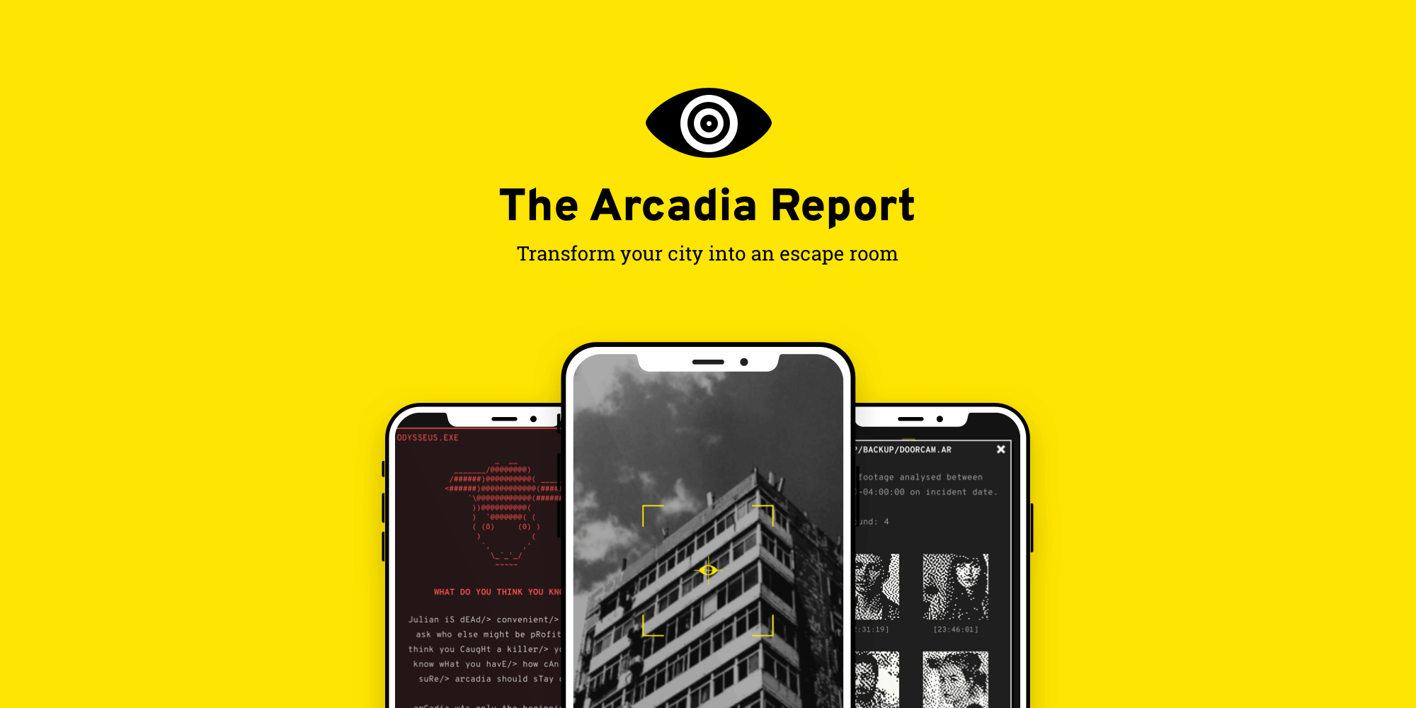
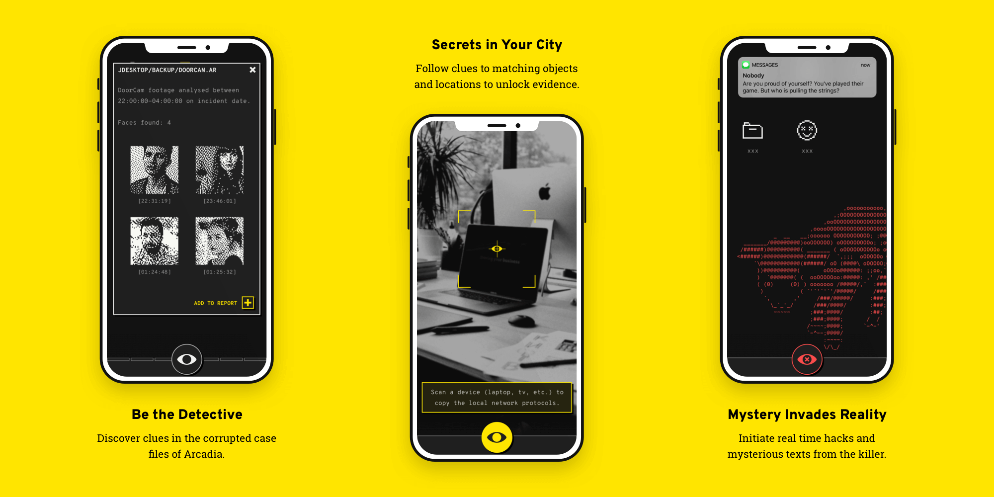
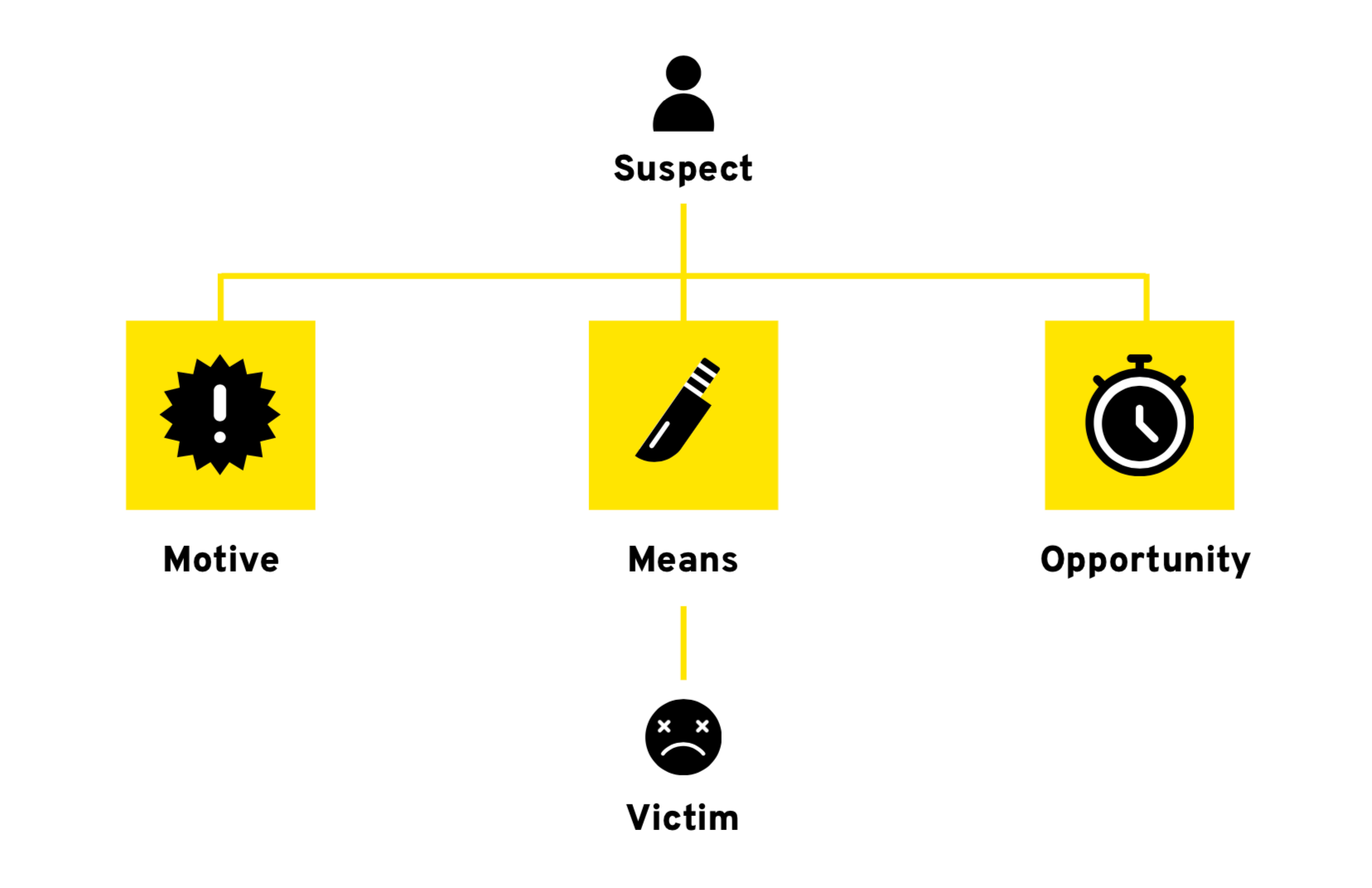
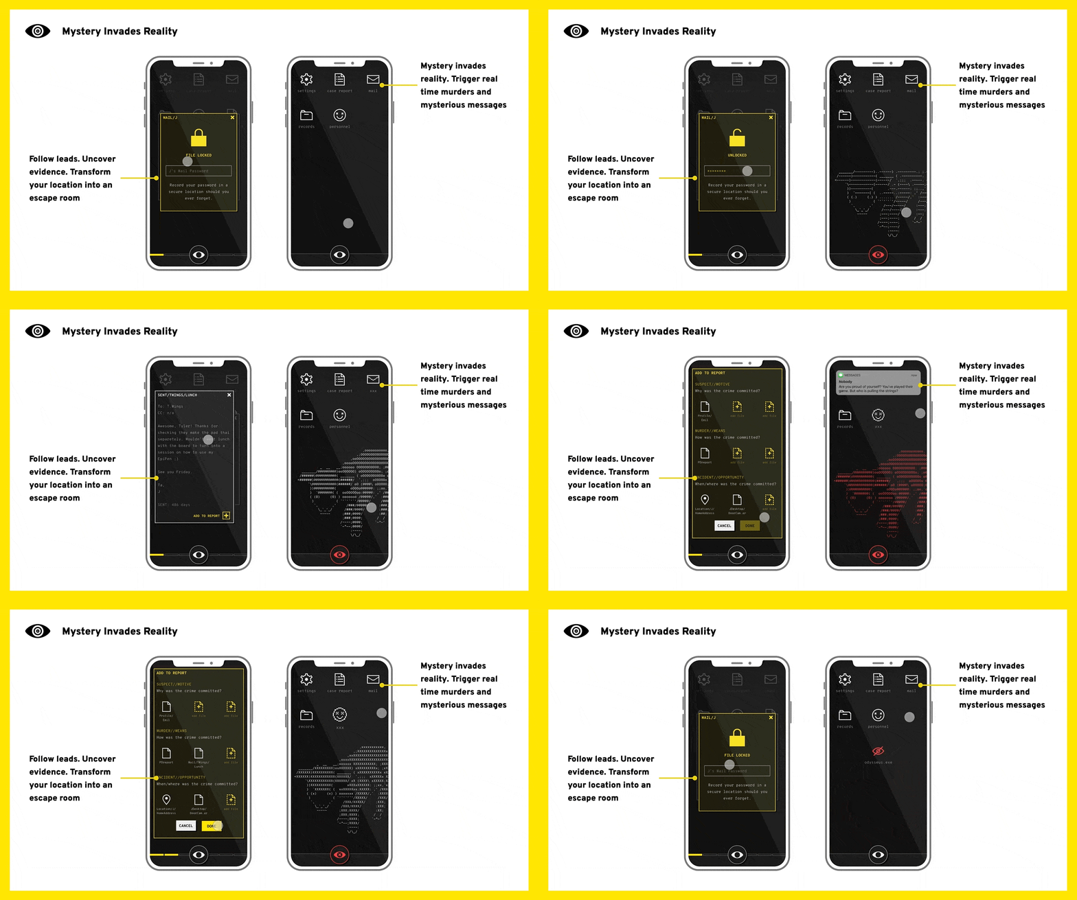
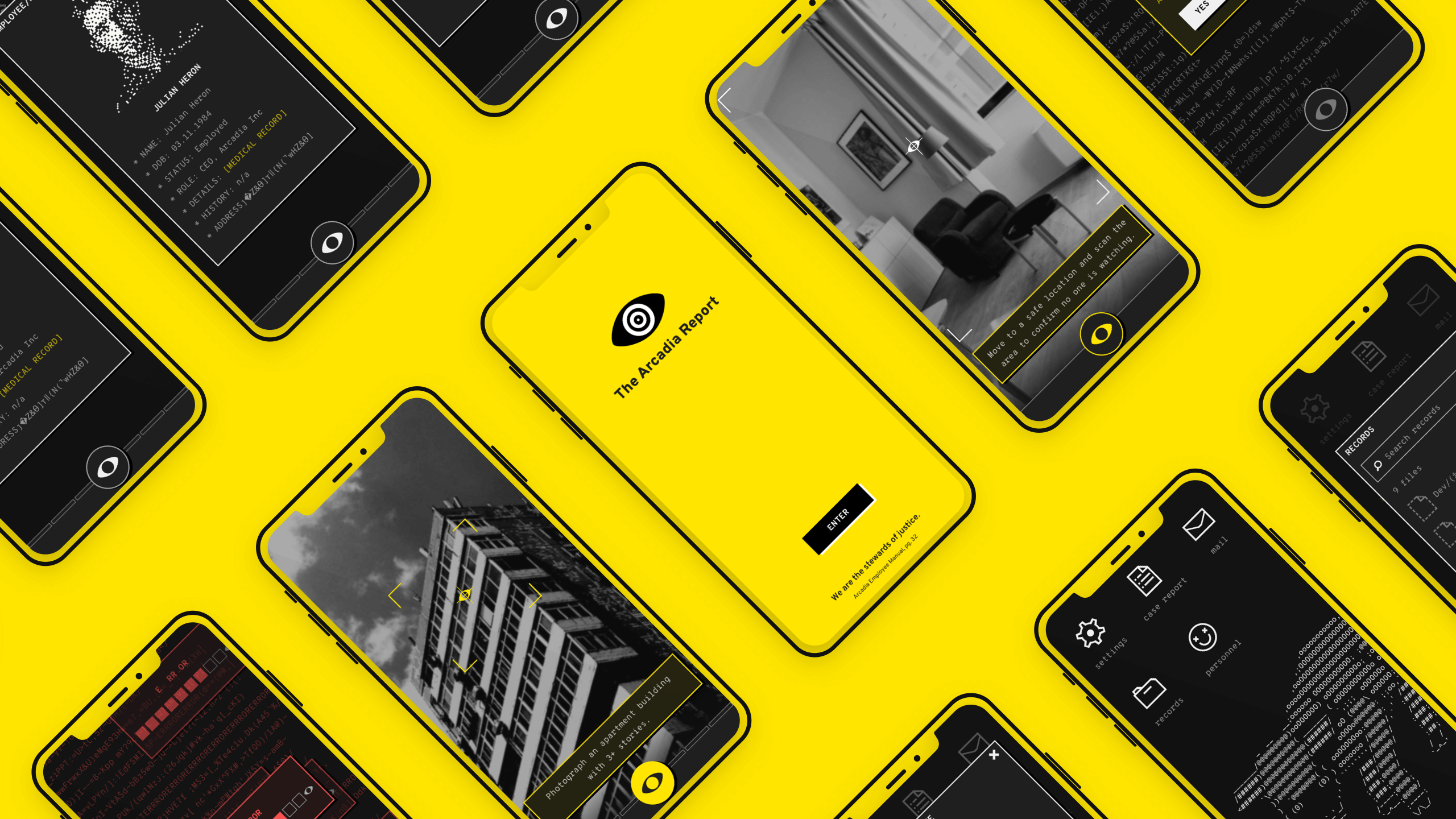
The Arcadia Report is an immersive murder mystery experience, transforming your city into an escape room. An experience unique to you, the locations around you become part of the game and can trigger text messages from the killer or even real time murders for you to solve as you explore your world. Mystery invades to reality. Find real world locations that match descriptions to unlock clues and uncover the secrets of Arcadia as you delve into corrupted records of a failed startup with murderous consequences. The Arcadia Report is more than a game, it’s a platform for stories you experience.
Details
- COMPANY: Studio Redacted
- ROLE: Game Design, UX, Product Management
- TIMELINE: 4 months iterative prototyping and testing, 3 months to MVP.
- TOOLS: Figma, Sketch, Flinto, Mailchimp, HTML/CSS, and so many post-its.
- SPECIAL THANKS: The ixdbelfast squad (Paul, Chris, Kyle), Puppet UX maestros (Rick, John, Sig), and the many victims of early prototypes.
- MADE TO THE SOUND OF: Doja Cat - Boss Bitch and stress
Challenge
Create a new mode of entertainment made for the experience generation, specifically millenials and those 18-45 years olds who prefer experiences over buying goods in the ever-growing mobile gaming industry. All while laying the groundwork for a platform for immersive experiences that melds digital and real world interactions into a seamless narrative.
The twist: You're a one woman team, must learn new skills on the fly (startup financials and business models? How to design a mystery? Location-based gameplay systems? Camera UI?), and need a major redesign based on user testing. All while constantly researching because this is a new market space with few existing patterns, forcing synthesis of learnings from diverse areas to create an intuitive, enjoyable, and marketable experience.
Process
“Yoo this sounds dope, I’d definitely play this.“ — Research participant on Reddit
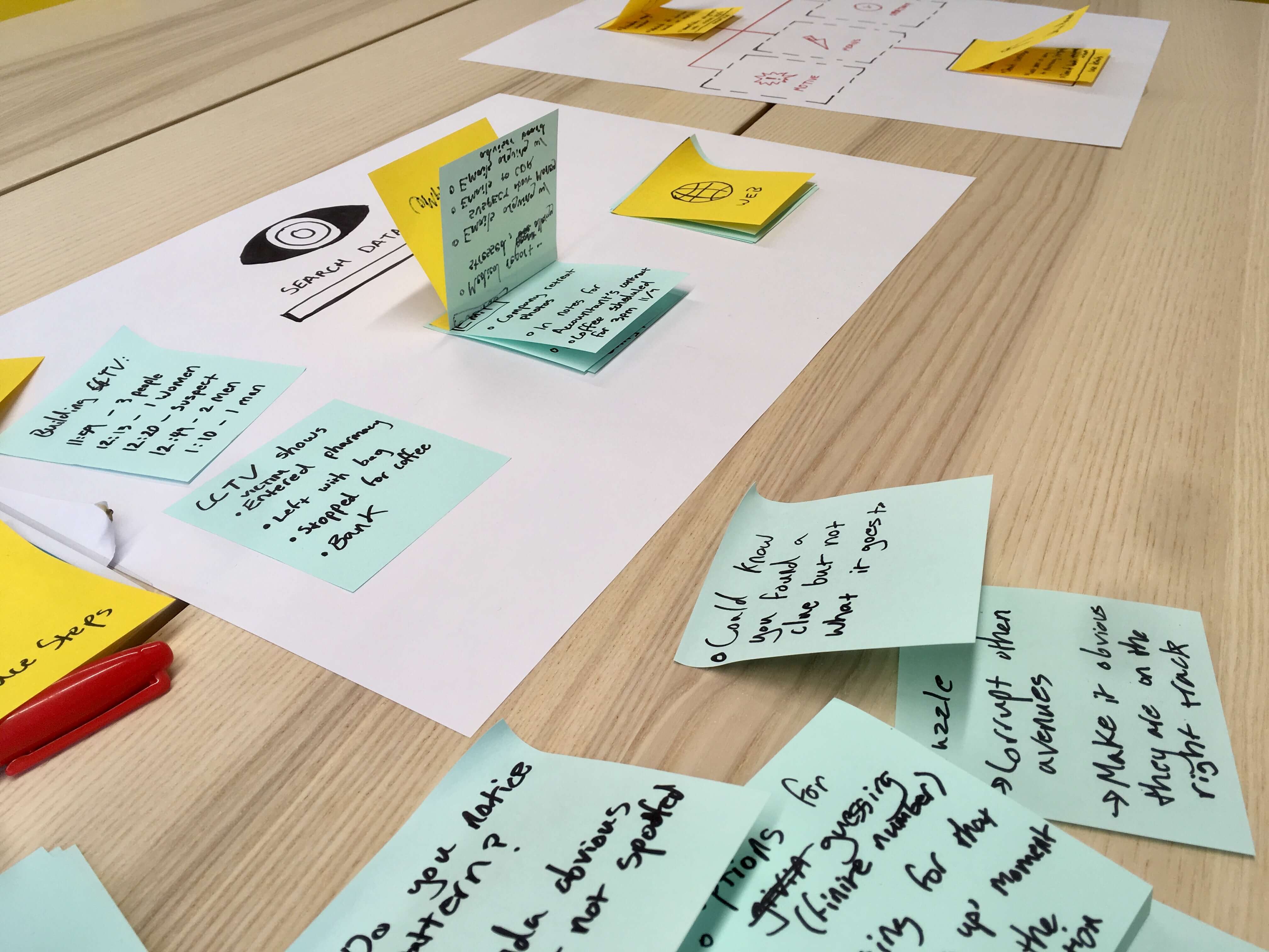
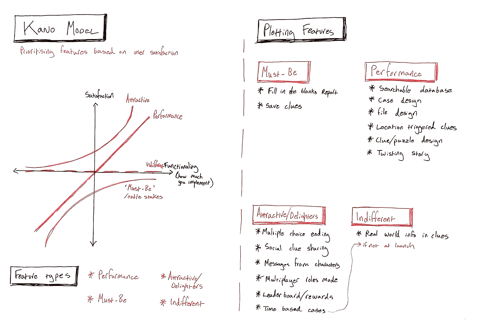
- Everything is new so iterate, iterate, and iterate again: 10+ prototypes. Iterative prototyping and research was key, starting with designing the simplest possible way to test an idea (the first test of the mystery system was post-its and paper and allowed improvements before ever wasting time on a pixel or line of code).
- So much research: Market research, competitive reviews, surveys, user interviews, usability studies, monitored and unmonitored, remote tests, and more depending on the prototype and what needed to be learnt.
- Design sprints: Sprints put iterative research cycles at the centre and focus attention to make more progress in less time.
- Building a community from scratch: Community-building and market validation, employing newsletters and targeting forums and analysing products with overlapping audiences, true crime podcasts, and viral sign-up incentives. In initial research, over 50% of surveyed users signed up to follow the project.
- Constantly pitching and refining the business plan: Pitches and funding applications helped refine the business-side of the project. In turn, that meant iterating on the best business model to generate enough revenue for the project and how that might impact the design, specifically of onboarding and freemium missions, and funding.
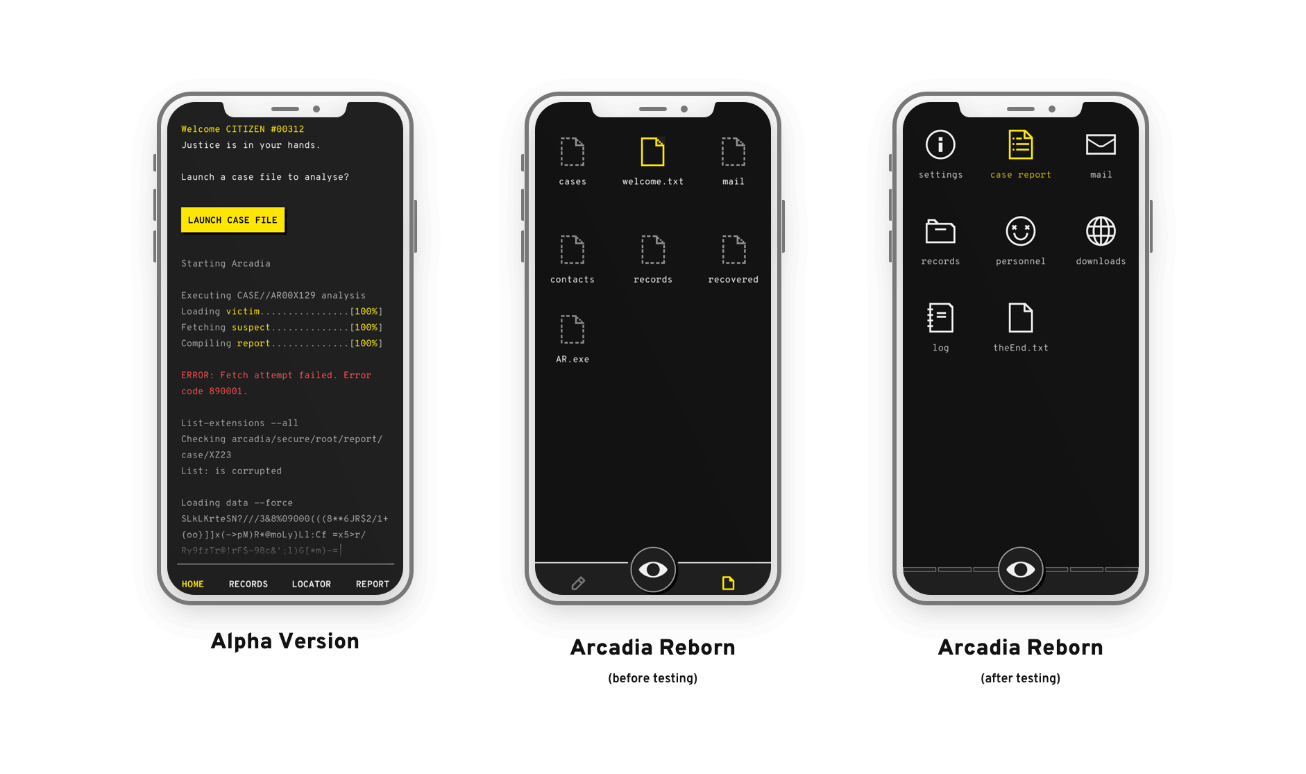
- Design systems and designing systems: I deconstructed (to reconstruct) UX and UI fundamentals to map out how to capture the feeling and aesthetic of a corrupted and 'broken' computer system (the central 'Arcadia' hub). The interface is a central character in the game and needed to feel corrupted while being an engaging (and useable) experience. Creating a simple but flexible central design system helped me keep iterating without wasting time updating prototypes every time.
- Learn on the go and be open to new ideas: Books, videos, pitches, mentors, and some excellent meetups to learn new game design, narrative planning methods, and product management tactics along the way.
Solution (and alternatives)
Every area of The Arcadia Report, from the concept and the design to the narrative and business model, evolved over many iterations. In the beginning, research helped narrow the early-adopter audience to indie gamers, true crime fans, and experience-craving millennials and the concept was far more more traditional. A focus on the 'game', being originally a subscription, physical mystery with optional digital extras before flipping to an app-based experience for the potential of integrated precise geolocation to pull you into the game.
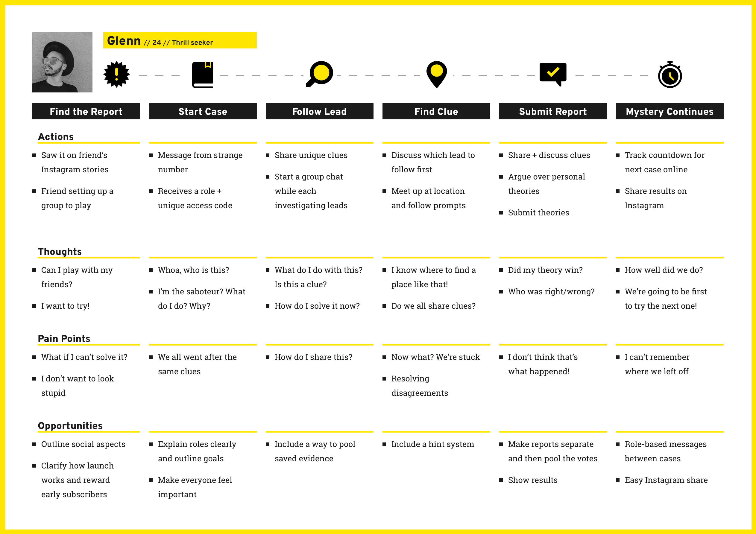
However, both of these solutions hinged upon the idea of immersing you in the game. The game is limited to its platform. To flip that idea and create a more memorable experience, I wanted to create a game that instead invades reality. Physical and digital interactions blend and you are no longer playing a game but experiencing a story playing out in your world, across platforms you recognise: from your favourite restaurant to text messages and the Arcadia app as a 'hub'. You will never see your city the same way again. This concept, evolved from testing the geolocation-based, clue hunting gameplay with users, forms the bedrock of The Arcadia Report and transformed the approach from an app or game to a platform for sharing stories you experience.
Challenges:
- Wearing many hats: At every step, design decisions needed to be balanced with narrative and business considerations. It wasn't just thinking about the experience, suddenly I was also learning how to put together cash flow projections and iterating on business models.
- Breaking new ground: The project breaks into new areas of gaming, digital experiences, and storytelling. Competitive and market research helped validate the business opportunity but it was essential to figure out the simplest way to test an idea and talk to potential users from the start to validate (or invalidate) concepts.
- Gamifying a city: Location-based gameplay meant designing camera and geolocation functionality. A new experience for me and, since the overall concept was also new to players, I needed to create an intuitive design from scratch. Regular tests with users helped me tackle this through a series of iterative prototypes built as simply as possible to tighten the feedback loop.
- Crafting a nonlinear, interactive narrative: Research revealed players gamed in 5-30 minute chunks. That meant iterating on the writing and design of the narrative the same as the rest of the product to create bite-sized, modular missions. Stories needed to reward detailled play of the campaign while also being enjoyed casually or standalone. Within each, various routes to solving the mysteries were tested so they could be solved regardless of the order in which clues were collected.
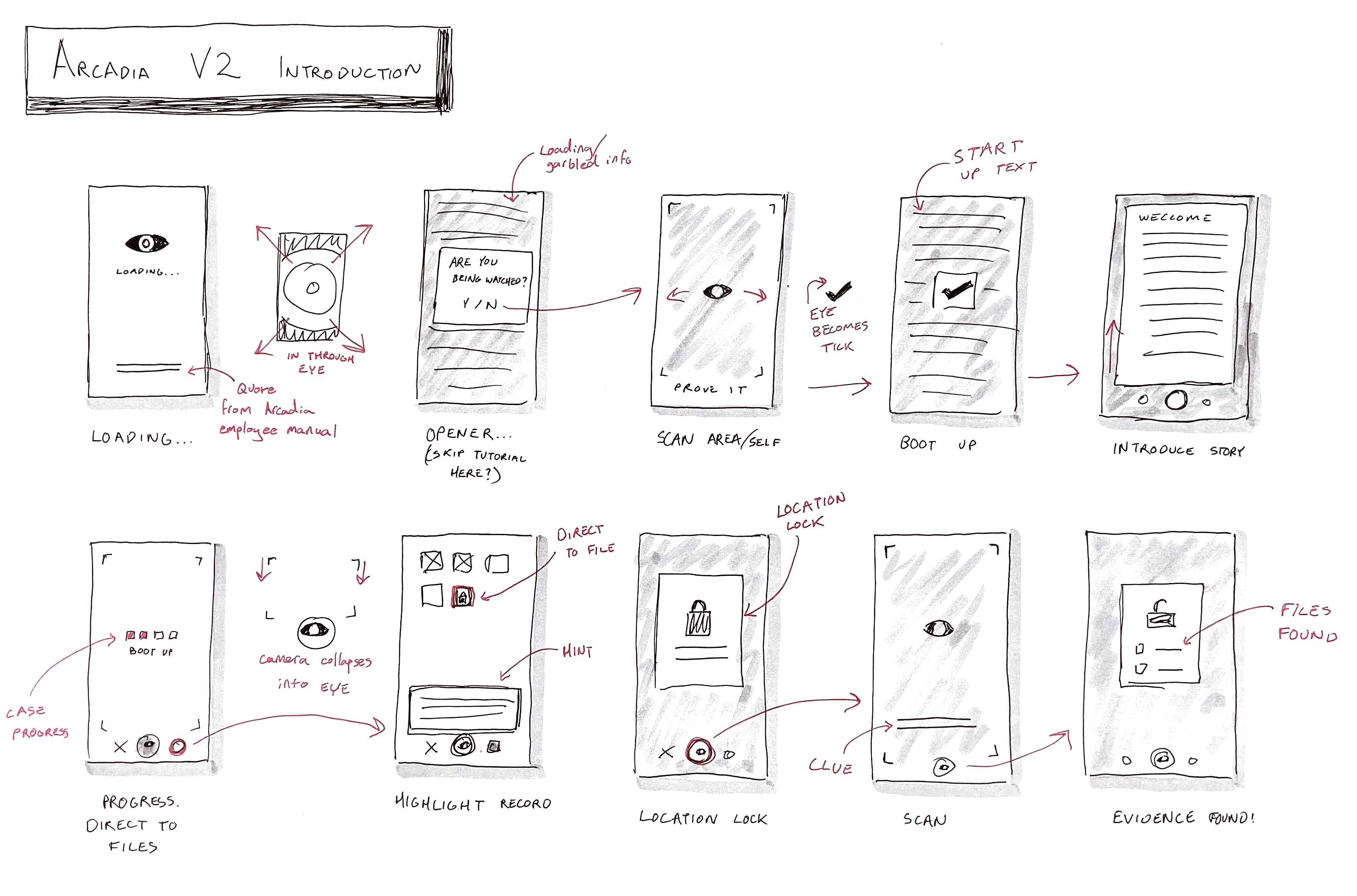
- Change of plans (but not timeline): Halfway through the project, user research revealed two huge problems: players were confused by how to gather clues and failed to complete the first mission. Analysing the feedback, I realised a total overhaul of the existing design and reimaging the introductory mission could address the issue... but I only three months left. Three adrenaline-fueled design sprints later, the overhauled tutorial mission and refined UX tested with 100% success (compared to 20% for the original design).
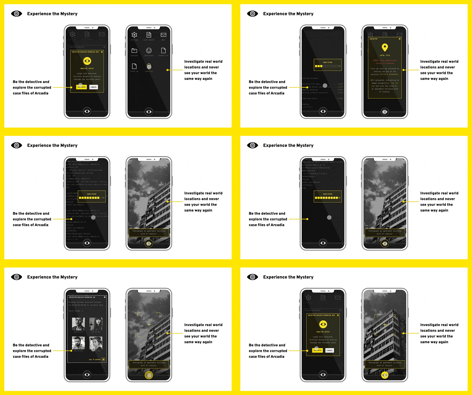
Outcome
“That was so cool!” — Early prototype tester
The Arcadia Report is much more than an app, it’s a platform for stories you experience. The framework is built for experiences that blend virtual and real world interactions. Mystery invades reality as the experience plays out across your world and digital networks: from texts on your device to to unlocking a clue at your local restaurant.
The underlying platform can expand to power any number of unique experiences. The possibilities are endless: from bespoke corporate onboarding trails to exploring ‘haunted’ locations with friends. Any city can be an escape room. This opens up licensing potential of both the platform and unique IPs generated, as well as alternate avenues of revenue in the form of partnerships with locations.
Ultimately, the redesigned Arcadia Report tested with 100% success (compared to 20% for the original design), won the national Student Invent award, and pitched to secure additional startup assistance.
Biggest Takeaways
- Perfection is the enemy of innovation: Attention to detail is crucial but The Arcadia Report would never have made it past the idea stage without a willingness to be scrappy, start simple, and evolve with research. Even so, I wish I had doubled down on this to create a smaller scale alpha and leave more time for launch and business considerations.
- Focus on the desired user outcome over the solution: Wearing many hats meant frequently changing gears from high level product strategy and system design to tactical execution. It helped me learn not to be precious about a particular solution. If I had to start again, I would be even more laser-focused on digging into the user outcomes to avoid the pitfalls where I became more caught up in the experience's delivery and interface than the overall experience and gameplay.
- You cannot know everything: The Arcadia Report would never have made it anywhere without the help of so many people, players, and amazing mentors. Be willing to admit what you don't know, ask for help, and not try to do a million different jobs.